
Your landing page is the face of your brand. More than often, it is the first impression. And first impressions matter. A high-converting and effective landing page is good on the eyes, packed with value bombs, and explains the offer in concise terms.
Here are relevant tips to create a high-converting landing page design.
#1. Understand your Audience and Conversion Objective
The look, feel, and layout of your landing page design determines how well it converts.
However, that’s subjective.
A good question to ask before you design a landing page is- what is the conversion objective and who is your target audience?
Do you want your visitor to download an e-book, sell a product, sign-up for a newsletter or simply fill out a form?
Is your audience a first-time visitor, or are they already a part of your sales funnel?
Having clarity about your conversion objective, and audience stage sets a cornerstone for designing a landing page that’s more personalized.
#2. Minimal Design and Beautifully Organized Visuals
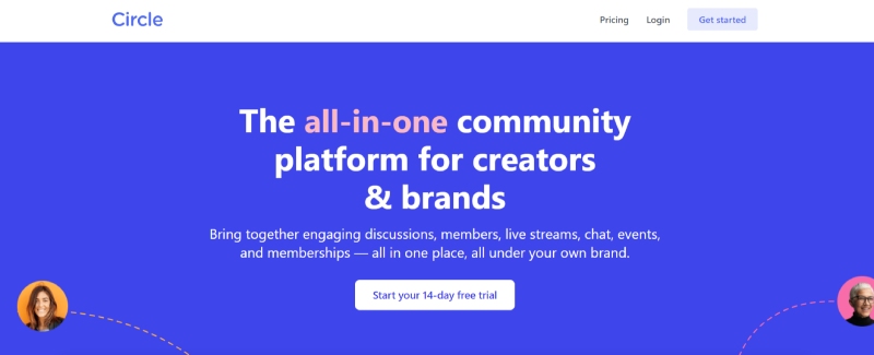
As mentioned previously, first impression matters, more so in design. Your landing page design should enamor your visitor. Make use of powerful and eye-catchy images, and calming contrasts. Be wary of your color palette, because every color induces a certain type of emotion.
Your background and CTA’s should have a distinct contrast but at the same should not be heavy on the eye.
And lastly, make use of white space well.
#3. Trust Signals
Trust signals help build credibility and inspire confidence in your brand.
Popular examples of trust signals are customer testimonials (text or video), product reviews, social shares, security badges or seals, availability of social profiles, customer brand logos, and newsletter subscribers.
Place your trust signal elements in a way that they don’t come in the way of your value proposition, and at the same time doesn’t go unnoticed.
#4. Compelling Copy
Texty and cluttered landing pages can lead to a high bounce rate. Here are quick pointers to writing a landing page copy that converts-
- Less is more
- Know your audience well, and try to make use of the words they use
- Present the most important information first, build curiosity and then dive into details
- Make sure the copy is easy to skim through
- Present features as benefits
- End your copy in a way that compels your visitor to click on the CTA by adding a sense of scarcity or urgency.
#5. Mobile-Friendly
Slow landing pages can shoot up your bounce rate, and eventually leave a negative impact on your conversion rate.
Your landing page design must be optimized for mobile because more than 80% of people today open websites on their mobiles.
Copy-pasting design from your desktop’s landing page is not recommended. Instead, design a separate landing page that is specifically planned to be featured on tablets and mobiles.
Before you design, draft your target audience’s journey, on mobile and desktop both. Jot down differences and similarities in their respective user experiences so that you can create an optimized journey across all screens.
Hiring a professional for digital graphic design services will ensure that your landing page design is optimized for mobile.
Refer to this guide by Google.
#6. Reduce bounce rate with a stellar headline
Your headline can make or break the deal. Drafting a good headline takes some brainstorming.
- Prioritize message match. The moment your visitor lands on your page, the headline should reaffirm that they are at the right place.
- Clear > clever. Yes, being witty is good, but make sure your message is crystal clear first.
- Don’t’ reinvent the wheel. Keep your headline simple, and go with the basic formula i.e. sell the benefits, hook the reader or solve a pain point.
#7. Embed videos to convert better
Marketers that embed video in their landing pages experience a 34% higher conversion rate.
Messages that cannot be easily conveyed via copy, images, or animations can be conveyed with a video. Testimonial and explainer videos are commonly used.
#8. Irresistible CTA’s

Great Jones
CTA buttons are a quintessential part of any landing page. A landing page should have at least 2 CTA buttons.
Here are a few tips to create a good CTA-
- Action-packed text. Start your free trial, download a free e-book, Reserve your seat are a few examples
- CTA color. Make sure it is striking. Red color is a good CTA color as it is related to enhanced memory and attention to detail.
- Make sure the text is easy to read and legible.
- Address in 1st person. Words ‘our’ should be avoided, and replaced with ‘your’.
It’s time to create stunning landing pages that convert like hotcakes.